Fora Therapy — Website & Mobile
Led the redesign of Fora’s progress note workflow for Allied Health Assistants and Professionals. In 2.5 weeks we made note-taking mobile-friendly, standardised it with SOAP, and built a feedback loop that lifted note quality and reduced back-and-forth.

Role

Lead UX/UI Designer

Client

CD Movement

Year

May-Aug 2022

Services

UX/UI Design

Design System

UX Audit

✨ Key design highlights
  • Immediate orientation
    A full-width progress bar and fixed Prev/Next buttons keep every step clear.

  • Scan-and-select cards
    Machines and packages appear as swipeable cards with roomy arrows for easy browsing.

  • Instant selection feedback
    Chosen cards gain a bold border and tick badge to confirm the pick.

  • Always-visible cost
    A sticky summary drawer shows the live total and the sole Next action.

  • Streamlined modals
    Uniform, larger pop-ups and inputs make edits feel intuitive.

🎯 Setting clear targets
To guide our launch and measure success, we defined three key goals:
  • Reduce step-1 drop-off by 25% to improve initial engagement
  • Save 20 seconds per step on average to accelerate the flow
  • Cut confusion-related clicks in half to boost confidence
We’ll track these metrics via analytics and A/B tests once the redesign is live; final results are pending.

Subscription Management

2.1 Understanding the problem

We began with two reality checks—Customer Care Centre feedback and a heuristic evaluation
to pinpoint why subscribers struggled:

What users were saying :


“This change has created a lot more work for me… I have about two years left on my plan.”

“How much do I still owe?”

“When is the next charge?”

“When is my next equipment drop, and can I move it?”

“Where’s my payment summary?”

“Is this a purchase or part of my subscription?”

From these insights, five core pain points emerged:

Payment Clarity

Users can’t see their current balance or next charge date at a glance.

Flexible Repayment

A recent system change forces weekly payments. Many customers want fortnightly or monthly schedules to match their pay cycle.

Easy Records

Weekly invoices must be downloaded one by one. For multi-year plans that means 100+ extra downloads, adding needless admin.

Drop Control

Customers struggle to find the date of their next equipment shipment—or cancel, postpone, or bring it forward.

Seperate the mixed order types

Purchase orders and subscription drops look identical in the current “My Orders” list, so users can’t tell which is which.

2.2 Design solutions & Iterations

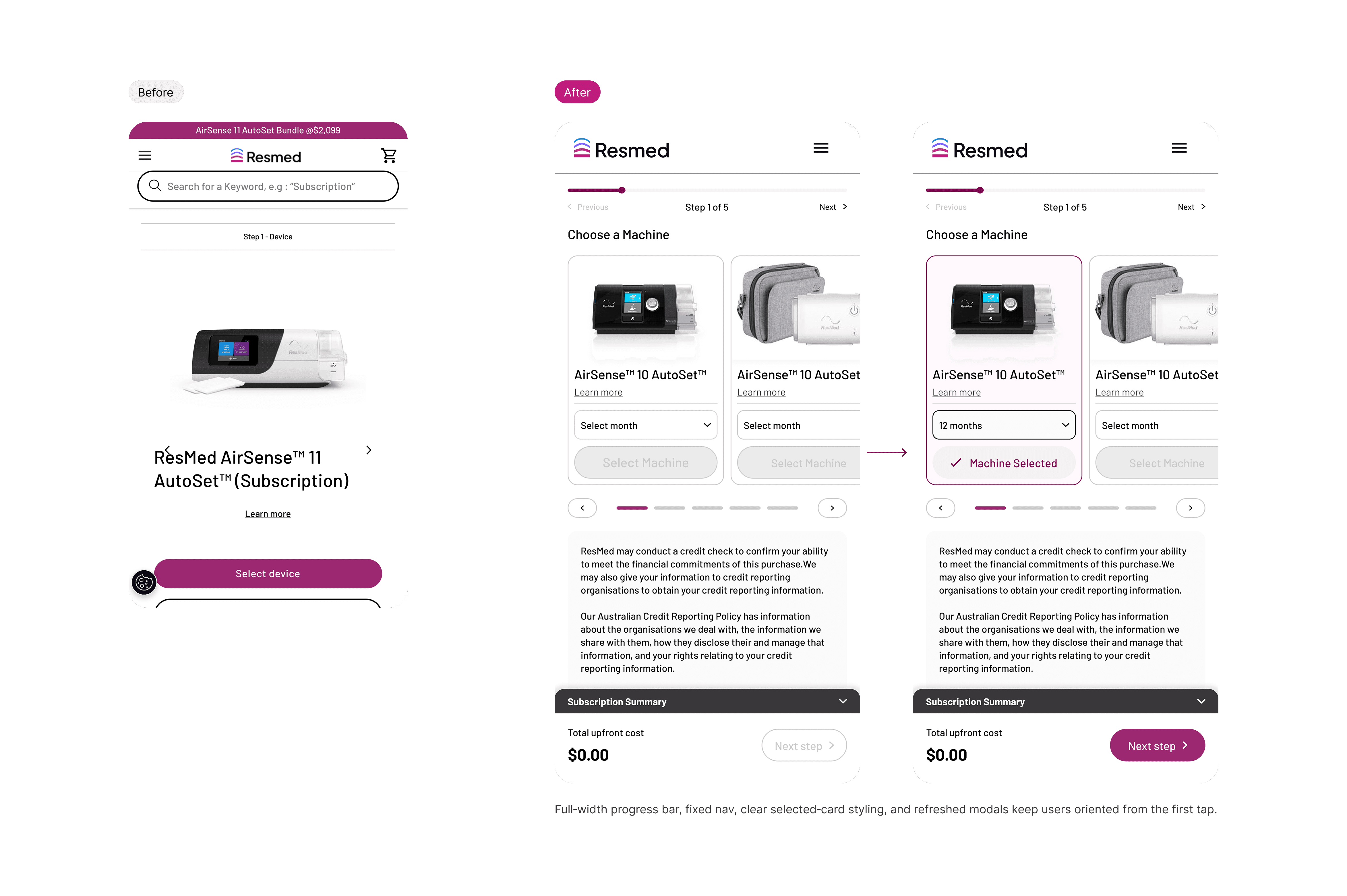
One-stop hub for orders, subscriptions & account details

Our audit showed the “My Account” area scattered key tasks across seven tabs and too many clicks. The redesign merges, labels, and streamlines everything into one clear flow.

🚀 Next Step,

Bringing Resmed’s refreshed brand into a redesigned user journey

With ResMed’s brand refresh now launched, our goal is to fully integrate the updated identity into the subscription experience by August 2025. Here’s how we’ll get there:

System & Assets

  • Migrate to the refreshed header, typography, and color tokens.

  • Publish a unified Figma library for all components.

Phased rollout

  • AU launch (Aug 2025): Release the new builder + dashboard on resmed.com.au.

  • Global rollout: Extend updates to US and regional sites, adapting local content.

Measurement & iteration

  • Define KPIs (conversion rate, task time, support volume) at AU launch.

  • Track analytics and run in-product surveys to validate UX improvements.

By anchoring our technical build in the new brand system and phasing the release by region, we’ll ensure a smooth transition for users and stakeholders alike—setting the stage for a fully unified ResMed experience worldwide.