Revamping ResMed’s Subscription Experience

When ResMed, an industry leader in sleep and respiratory care, saw mobile users dropping out of its five-step subscription builder through to ongoing account management. ResMed engaged us to reimagine the entire subscription journey.

Our goal was to create a cohesive, scalable experience that honours the refreshed brand identity while tackling the highest-impact pain points.

Client

Resmed

Year

2023-Current

Services

UX/UI Design

Design System

Consultation and Strategy

Contributors

Neville Ewers
Jack Nicholson

How might we build a scalable, engaging subscription system that
delights users at each touch point—from choosing a device to managing future deliveries?

How might we build a scalable, engaging subscription system that delights users at each touch point—from choosing a device to managing future deliveries?

Subscription builder

1.1 Understanding the problem

We began by auditing session recordings and analytics to uncover where users hesitated, clicked in frustration, or dropped out entirely.
This research revealed:

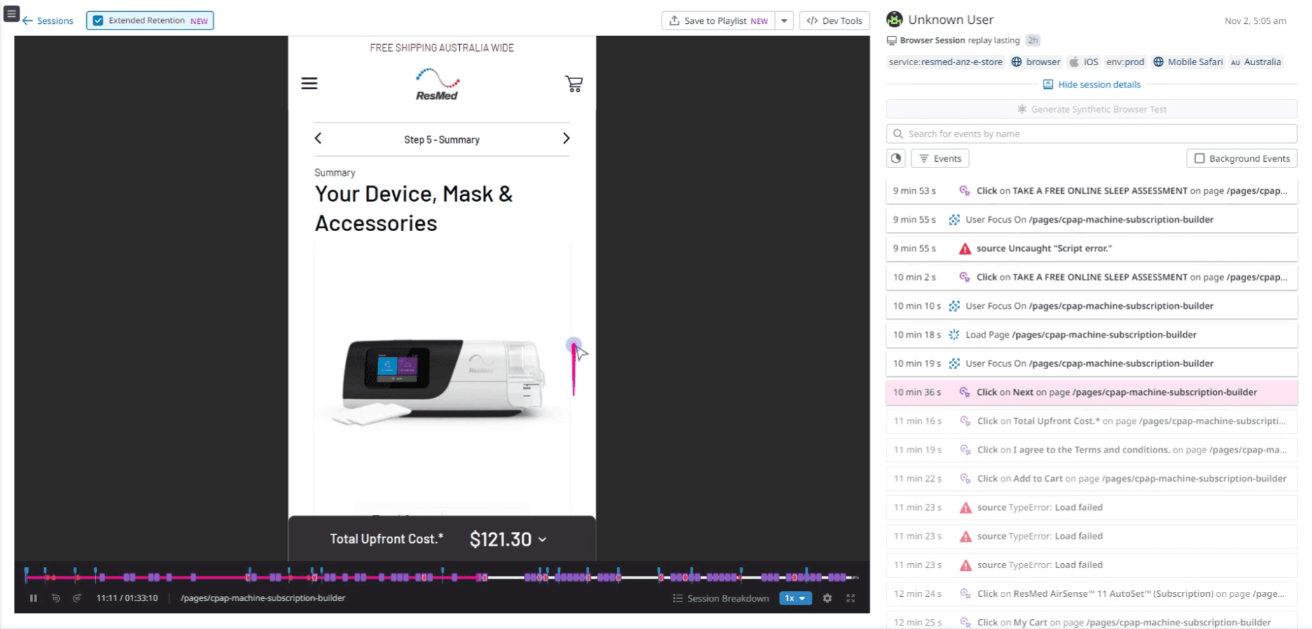
(Sifted through 4 x Customer screen recording videos and analytics to catch every pause, rage-click, and drop-off.)

Choosing products feels overwhelming
  • Shoppers keep opening the mask-size chart to double-check, then stall.

  • Accessories are added, removed, and added again while they try to decide.

  • Some tap the total price, hoping it will explain what’s included or why the cost changed.

Making changes (and knowing they worked) is tricky
  • Address and payment fields look editable, but they’re actually locked until you find a small “Edit” button.

  • Those buttons hide inside tiny overflow menus, so people bounce back and forth searching for them.

  • After clicking “Pause,” “Save,” or a price badge, nothing pops up to say “Done,” leaving users unsure if anything happened.

1.2 Journey-mapping validation

We traced the subscription flow screen by screen, layering in pain points from session replays and analytics to pinpoint where users stumble. Six key friction zones emerged—each with a straightforward MVP fix:

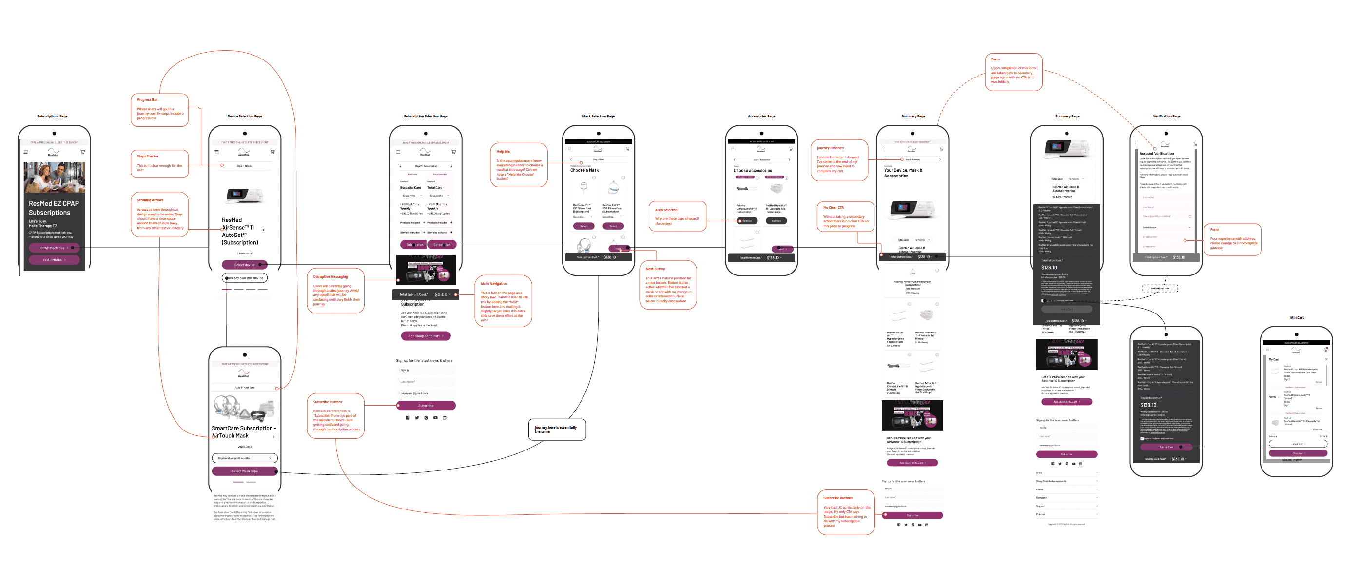
Each of these spots became a targeted quick-win in our MVP roadmap.

Lost at step 1
Hair-thin tracker and cramped arrows hid the five-step journey.
Device-screen detours
Promo banners and duplicate “Subscribe” CTAs stole attention, while the real Next button was buried in the header.
Mask paralysis
No “Help me choose” path and a floating Next button that stays active when nothing’s selected left shoppers guessing.
Accessory anxiety

Items arrived pre-selected without explanation, prompting distrust and hesitation.

Flat finish

The summary page lacked a strong "Add to cart"CTA, causing users to stall just before checkout.

Verification friction

Manual address entry (no autocomplete) and a dead-end return to Summary added effort just before checkout.

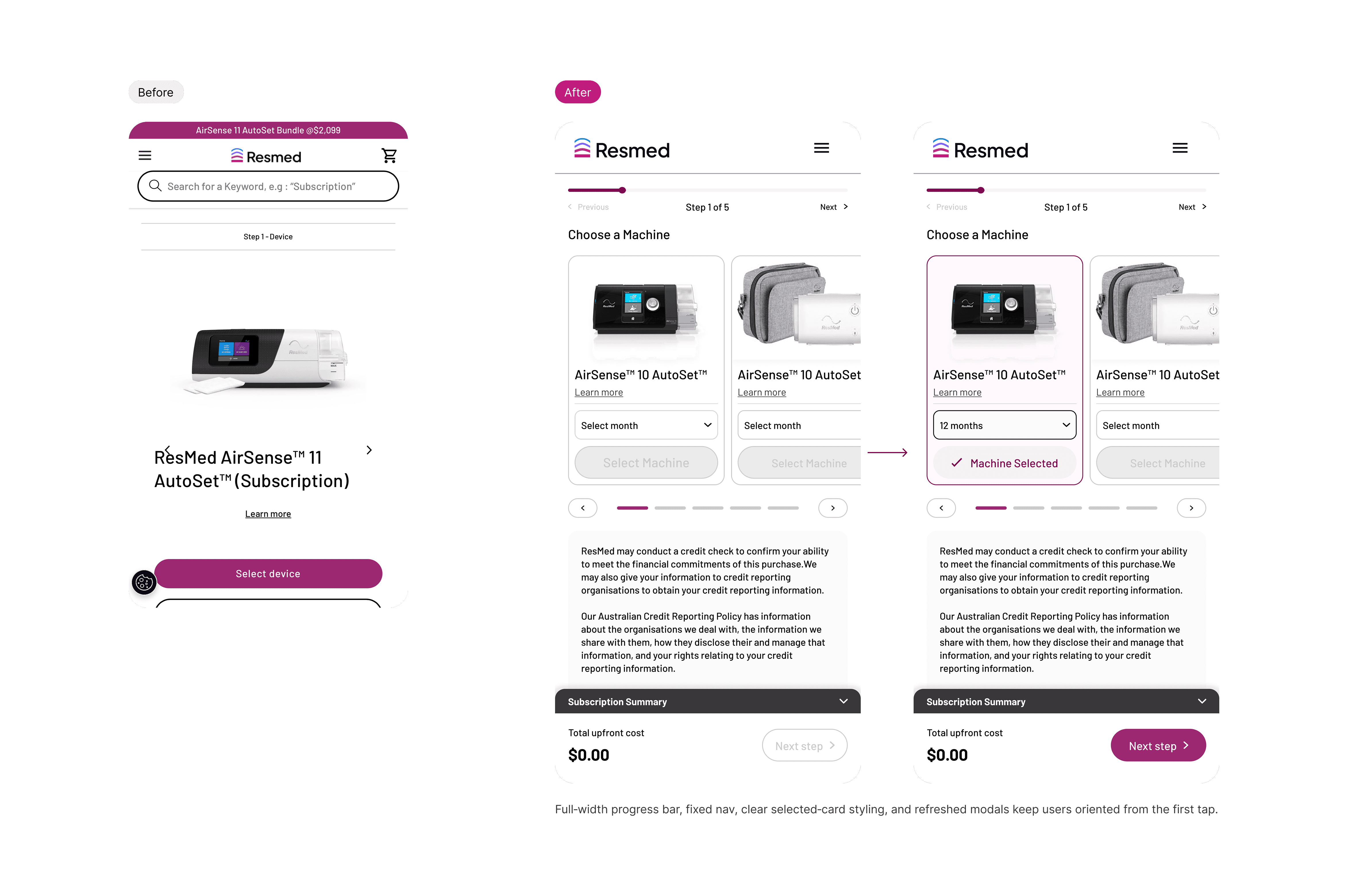
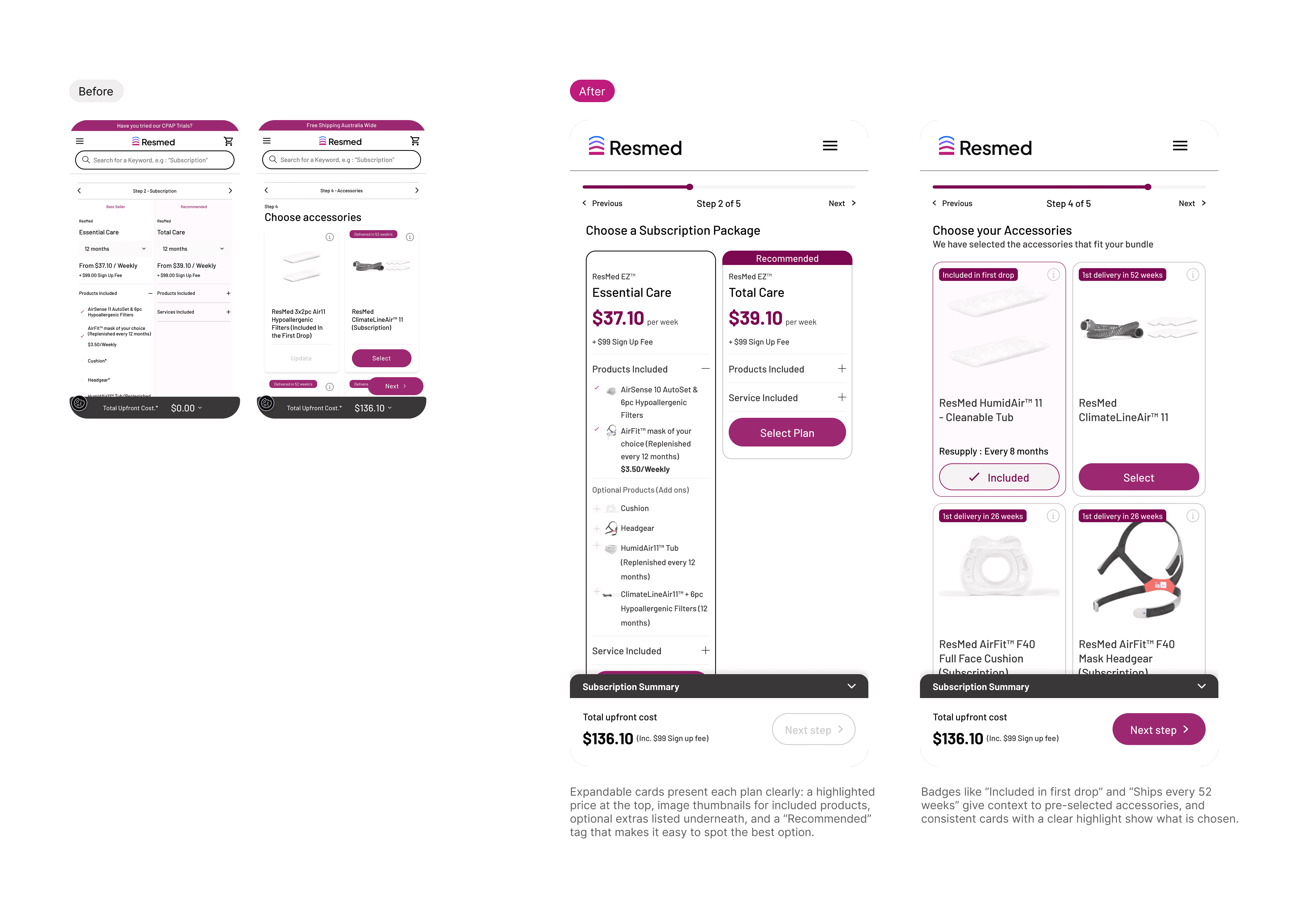
1.3 Design Solutions

Guiding users seamlessly from start to finish

The revamped journey feels like a guided tour: expectations are set up-front, each screen asks for just one decision, and no secondary promos break the rhythm. Supportive details stay within reach but never steal focus, so shoppers move through each step confidently—and reach checkout much faster.

✨ Key design highlights

  • Immediate orientation
    A full-width progress bar and fixed Prev/Next buttons keep every step clear.

  • Scan-and-select cards
    Machines and packages appear as swipeable cards with roomy arrows for easy browsing.

  • Instant selection feedback
    Chosen cards gain a bold border and tick badge to confirm the pick.

  • Always-visible cost
    A sticky summary drawer shows the live total and the sole Next action.

  • Streamlined modals
    Uniform, larger pop-ups and inputs make edits feel intuitive.

🎯 Setting clear targets
To guide our launch and measure success, we defined three key goals:
  • Reduce step-1 drop-off by 25% to improve initial engagement
  • Save 20 seconds per step on average to accelerate the flow
  • Cut confusion-related clicks in half to boost confidence
We’ll track these metrics via analytics and A/B tests once the redesign is live; final results are pending.

Subscription Management

2.1 Understanding the problem

We began with two reality checks—Customer Care Centre feedback and a heuristic evaluation
to pinpoint why subscribers struggled:

What users were saying :


“This change has created a lot more work for me… I have about two years left on my plan.”

“How much do I still owe?”

“When is the next charge?”

“When is my next equipment drop, and can I move it?”

“Where’s my payment summary?”

“Is this a purchase or part of my subscription?”

From these insights, five core pain points emerged:

Payment Clarity

Users can’t see their current balance or next charge date at a glance.

Flexible Repayment

A recent system change forces weekly payments. Many customers want fortnightly or monthly schedules to match their pay cycle.

Easy Records

Weekly invoices must be downloaded one by one. For multi-year plans that means 100+ extra downloads, adding needless admin.

Drop Control

Customers struggle to find the date of their next equipment shipment—or cancel, postpone, or bring it forward.

Seperate the mixed order types

Purchase orders and subscription drops look identical in the current “My Orders” list, so users can’t tell which is which.

2.2 Design solutions & Iterations

One-stop hub for orders, subscriptions & account details

Our audit showed the “My Account” area scattered key tasks across seven tabs and too many clicks. The redesign merges, labels, and streamlines everything into one clear flow.

🚀 Next Step,

Bringing Resmed’s refreshed brand into a redesigned user journey

With ResMed’s brand refresh now launched, our goal is to fully integrate the updated identity into the subscription experience by August 2025. Here’s how we’ll get there:

System & Assets

  • Migrate to the refreshed header, typography, and color tokens.

  • Publish a unified Figma library for all components.

Phased rollout

  • AU launch (Aug 2025): Release the new builder + dashboard on resmed.com.au.

  • Global rollout: Extend updates to US and regional sites, adapting local content.

Measurement & iteration

  • Define KPIs (conversion rate, task time, support volume) at AU launch.

  • Track analytics and run in-product surveys to validate UX improvements.

By anchoring our technical build in the new brand system and phasing the release by region, we’ll ensure a smooth transition for users and stakeholders alike—setting the stage for a fully unified ResMed experience worldwide.

Download CV

Get Template